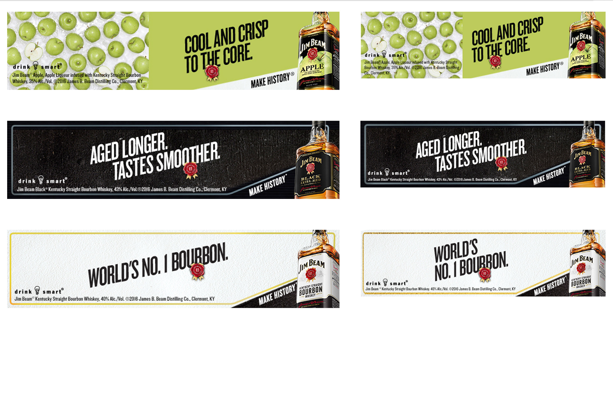
Jim Beam's rebrand is one of the most significant changes to the bottle design in decades. The goal was to use the same design in the more than 100 markets where Beam is sold across the globe. Previously, different designs have been used in different regions. The most noticeable change is the shape of the bottles. This campaign was part of that change.
Roles:
- Managed/Produced all print mechanicals and digital deliverables according to client and vendor specifications
- Collaborated with art directors, designers, and project managers designing agency creative
- Image retouching, color correction, and rebuilding print files for production
- Typesetting and layout
Project Deliverables:
- Full page and spread ads, print and digital billboards, wallscapes, posters, table tents, digital banners and tablet ads